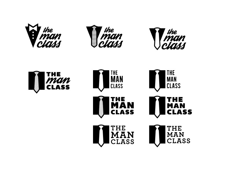
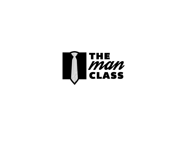
Nick and I refined our logo concept and simplified the mark itself. We took out the bow-tie and replaced it with a regular tie to make the design a bit more accessible. We also took out the triangular shape that represented the suit jacket and replaced it with a solid black square, which could represent a folded dress shirt.
Leave a reply
You must be logged in to post a comment.