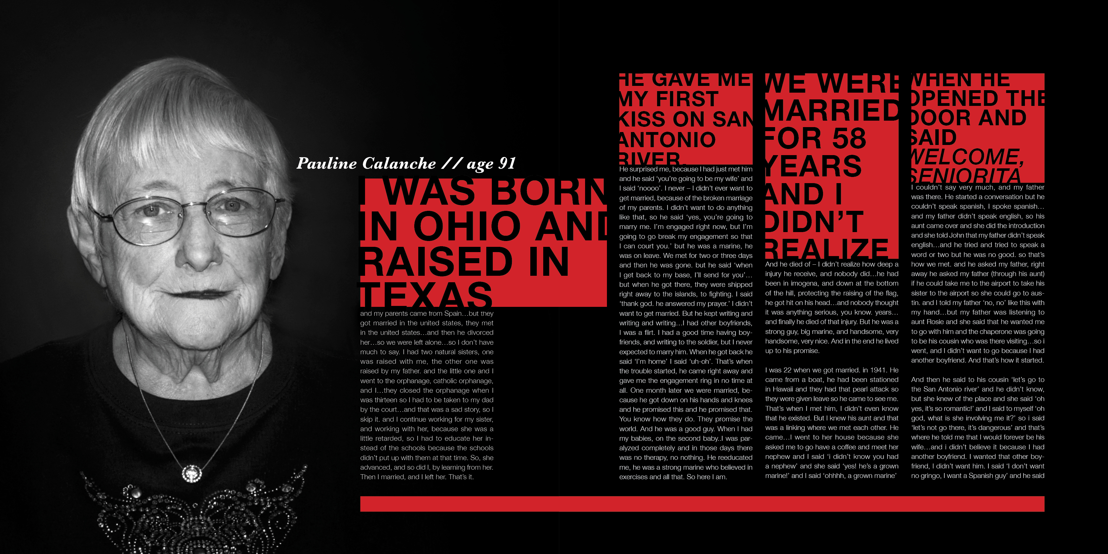
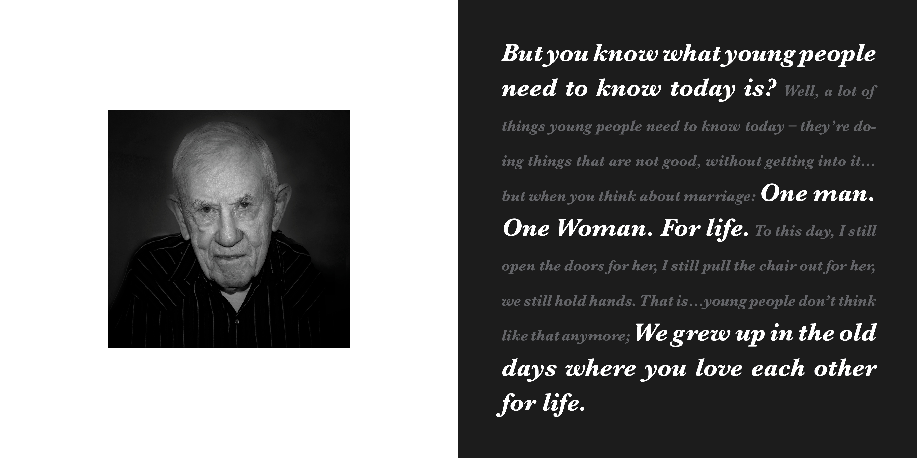
martin venezky, our guest designer for the year, is in town this week. though i missed his friday degree project crit, he saw some of my spreads on wednesday during the type4 crit. a big thing that he mentioned (and something i completely agree with) is that this design direction and image treatment is looking very dark, too dark for the subject matter. the red and black color scheme is feeling angry. this is what it had been looking like…
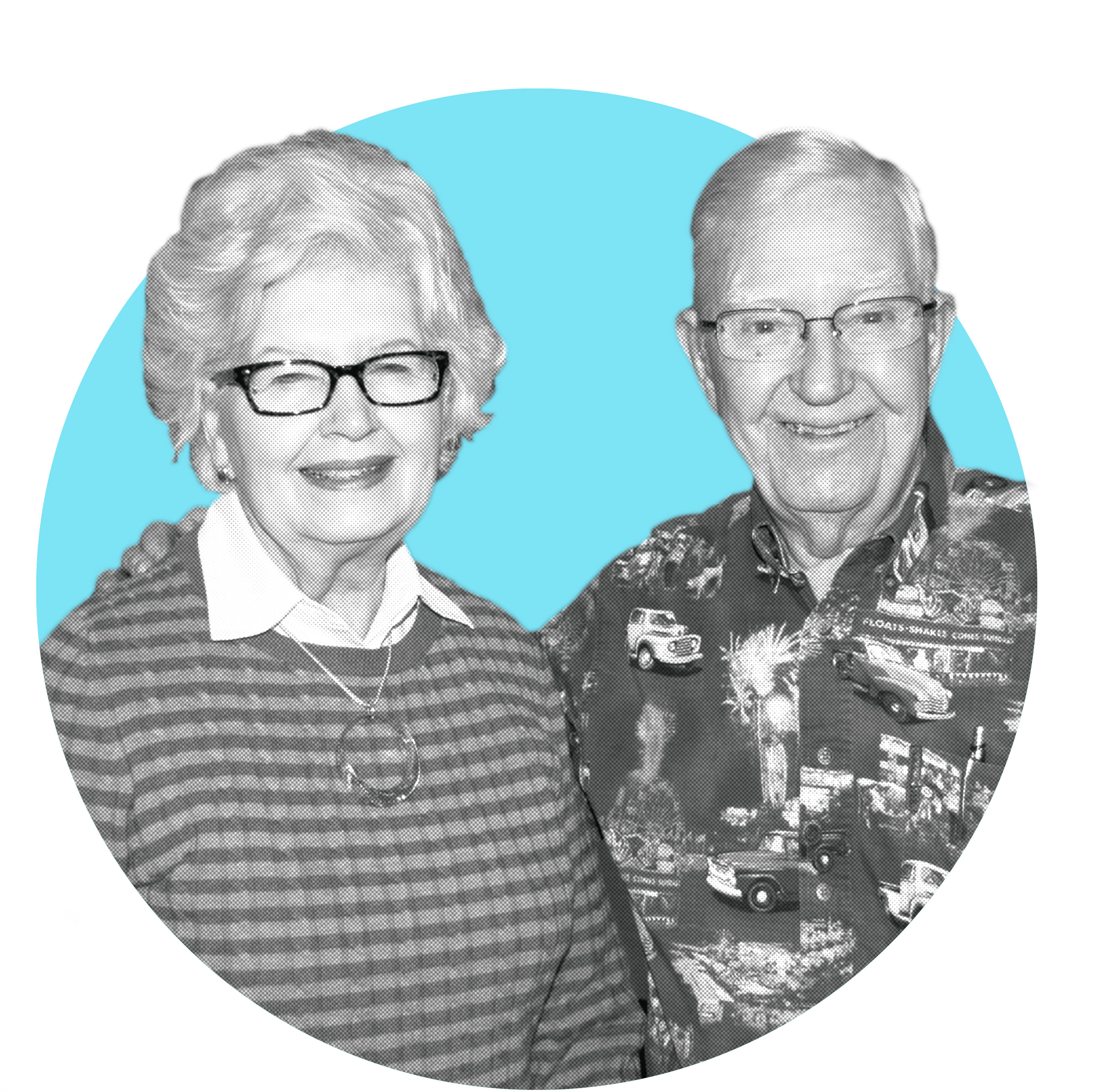
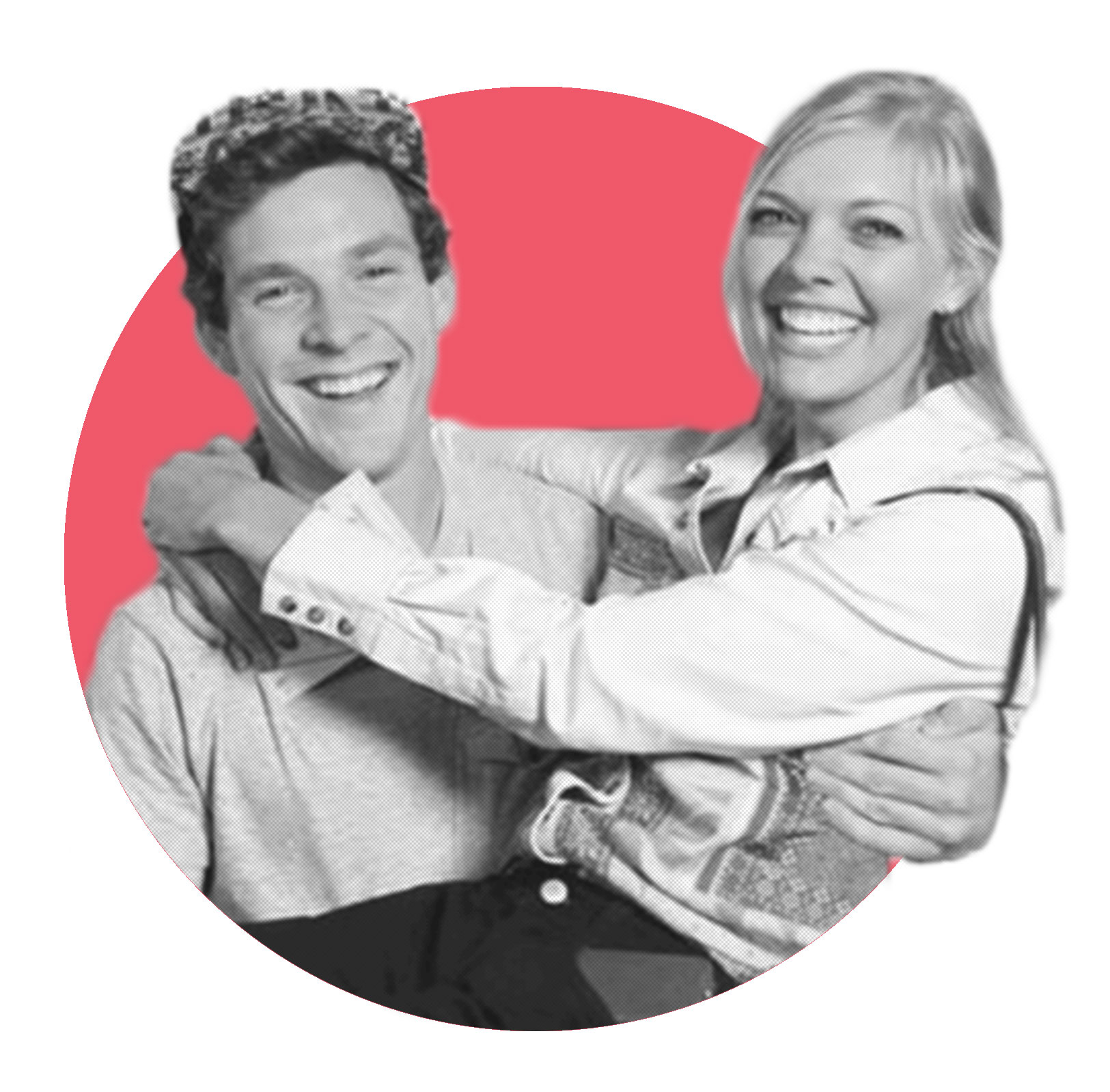
I have been playing around with different image styles. because of the quality of the images i was able to take at the retirement community (which is why i darkened out the background in the first round edits), i believe it would be best to cut out the background…but make it more lighthearted and bright. and something that i can use for the millennials images as well, i haven’t shown any of those yet. it’s all about love after all. prepare yourself. it’s a drastic development:

Leave a reply
You must be logged in to post a comment.